Taste the Colors
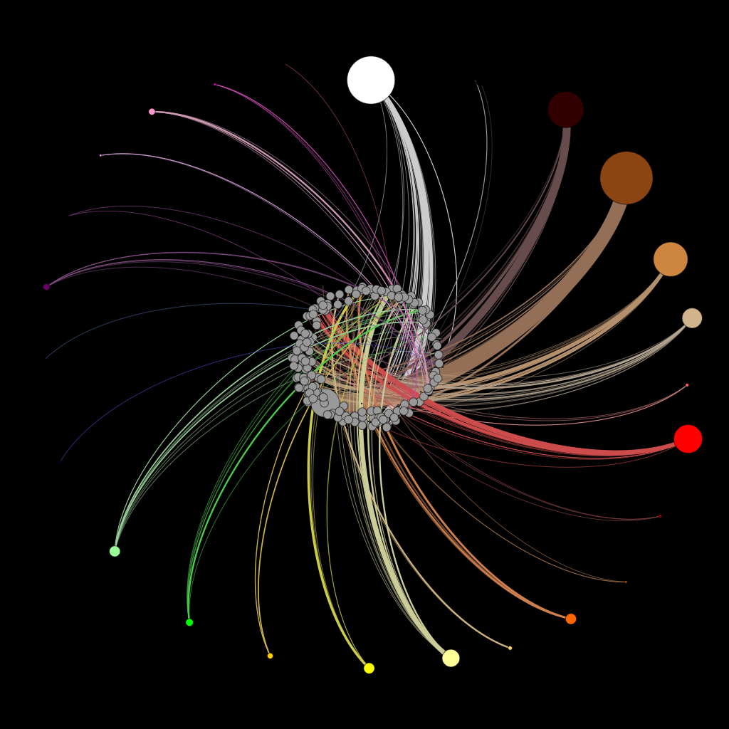
Our team created a color-wheel using the many different flavors in the database, distinguished by the number of times in which they occurred. Our objective was to group the flavors into colors based on similar colors to those they most closely related to in the physical world. The weight of the edges represents the number of times a flavor occurred in the database. For instance, thicker lines indicate that the flavor was selected by a higher number of people – such as chocolate. The node's size is also based on the weight of the edges. Using several different colors to represent several groups of flavors, we were able to create a color wheel by moving the target nodes away from the source nodes in a circular pattern.
When interpreting the color-wheel, you will notice the brown node represents flavors such as chocolate and meats, etc. Although the aforementioned "brown" colors occurred most frequently in our data, other flavors were assigned their colors arbitrarily in order to provide distinction to each group. Given the vast amount of data present in this study, we had to take certain liberties in selecting our colors for the color wheel, simply for aesthetic purposes. However, when choosing, we did our best to select colors most closely resembling the flavors they represented.
There are twenty-eight distinct color shades within the color wheel, including light and dark versions of each color that were used (e.g. green, light green, dark green, etc.). The color-wheel serves as a representation of the collected data, designed solely to create a more aesthetically pleasing visualization of the incorporated data than say, your standard "bar graphs" or "pie charts".
Individual GIF Elements