What sickness tastes like...
This project was designed to create a practical application for the food data we collected by analyzing its relationship with potential foodborne diseases. Our goal was to show what data like this could be used for on a massive scale using known foodborne illness research to create comprehensive graphs indicating what diseases the population is at the highest risk of spreading based on their food preferences.
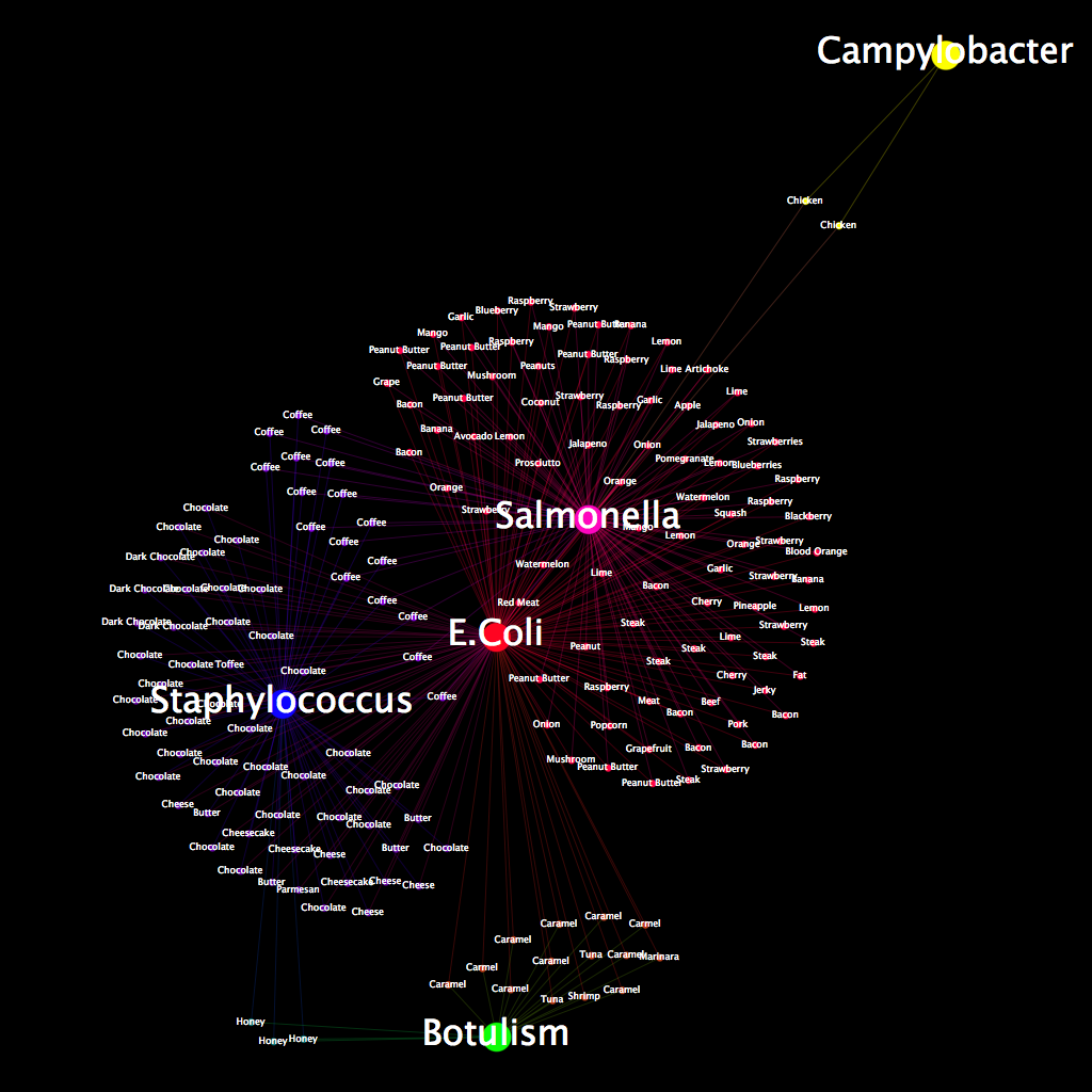
After removing all data entries that did not directly correlate with a particular food, we created this project by first doing some research on foodborne illnesses and what foods are most often associated with them. The idea here was to create a profile of illnesses associated with each particular entry in our data-set so that we could map out the comparisons in a meaningful way. After visiting various sites and getting a basic understanding of what diseases we wanted to showcase in this project, we narrowed our list to five: E. coli, botulism, campylobacter, salmonella, and staphylococcus. We chose these five because they were both relevant to the data we collected and provided an interesting array of diseases with which we could create comparisons. Of the five, we chose one of the rarer foodborne illnesses, campylobacter, to show how it would affect a graph of this nature. Once we chose these five illnesses, we created a profile for each kind of food and then created edges based on these profiles. For fruits and veggies, for example, we created edges with E. coli and salmonella. For dairy products, we chose E. coli and staphylococcus. For anything that did not fit neatly into a particular category, we made a judgment call based on how it was made or what it is composed of.
As for interpreting the graph, we designed it to be simple in its comparison of foods and the illnesses associated with them. E. coli, which had the most edges of any of the diseases we chose, is centered in the middle of the graph. We then used a color scheme that would show which nodes were attached to what diseases. Each node has two edges, and is therefore a combination of the color we chose from each disease.
Jake Muir and Katrina Thoresen