Marketable Flavor Paths. Gerek Strickland.
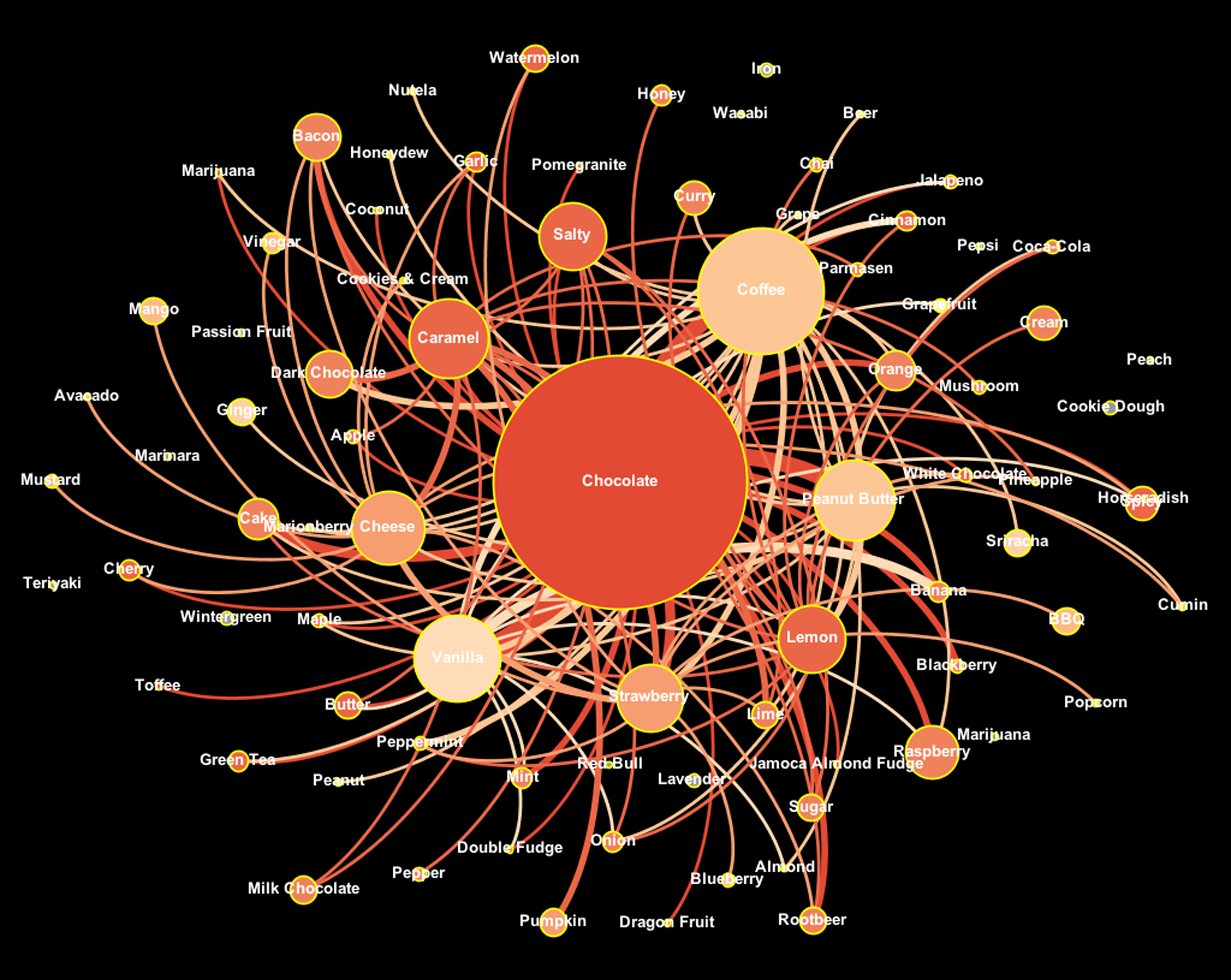
Each of the visualizations was designed to find flavors that are marketable to people who like the most popular flavor, chocolate. The first design, which I have named the Heat Significance Spiral Model, puts chocolate in the middle and paths that spiral outward to other flavors. To interpret which paths to follow, a heat significance of color was used based off of chocolate. Therefore, each of the nodes that have the heaviest weighted edge coming from chocolate will be the brightest color. Nodes also reflect through size and position, which flavors had a higher number of people who liked them. Simply put, the closer to the center and larger the node is, the more people that liked that flavor. The brighter colored nodes near the center will be the more marketable flavors to people who like chocolate.
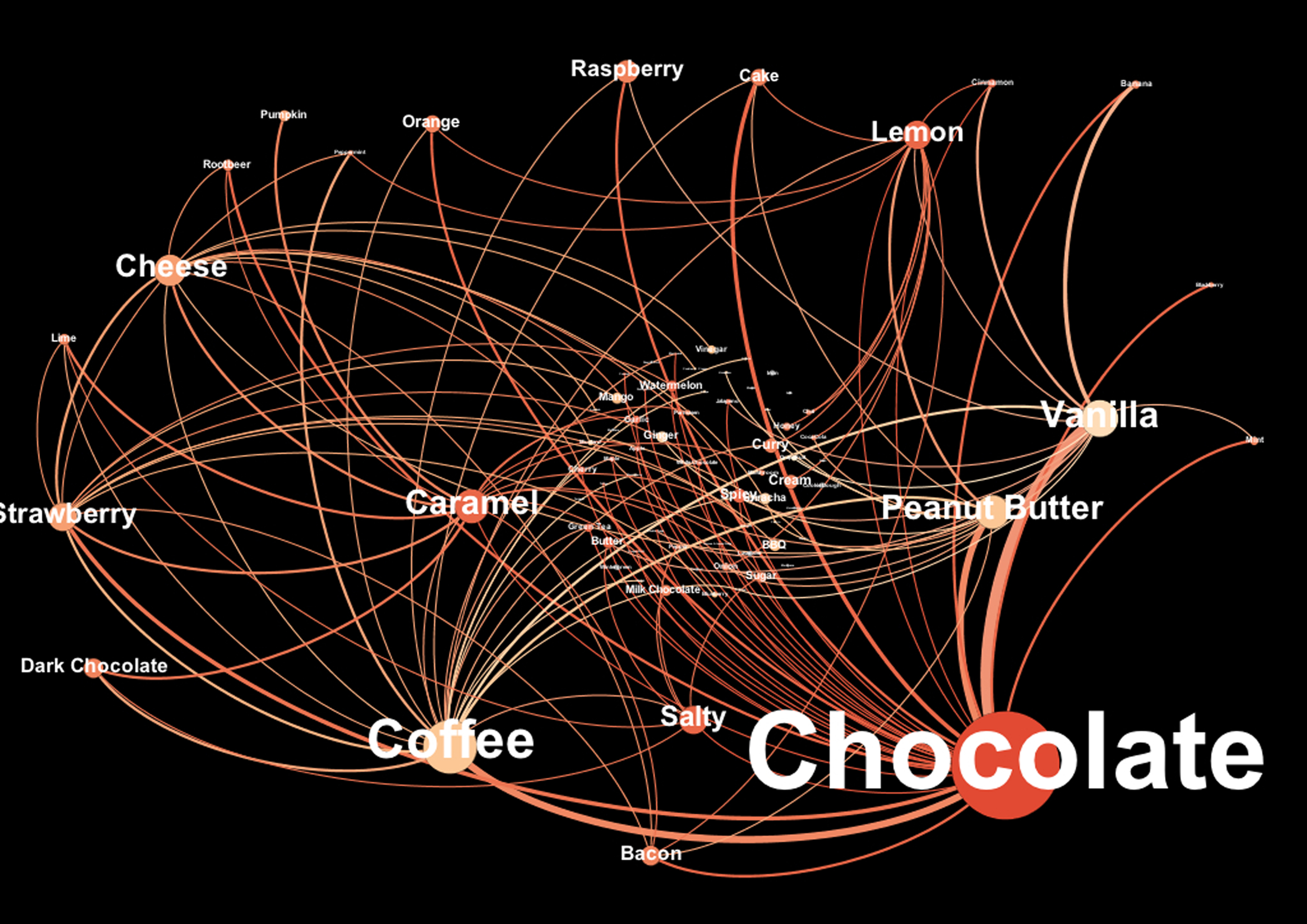
The second model, called the Heat Significance Blowout Model works similarly to the Heat Significance Spiral Model. This model focuses on the edge weight from chocolate to other flavors more than anything else. Each edge is weighted based off how many people liked the two flavors. These are the more marketable flavor paths. To help make path reading easier, each flavor that has a 2 person weighted edge or greater connected to chocolate is blown out from the center to the edge of the image, hence the use of the term "blowout." Label and node size are used to show quantitative significance.
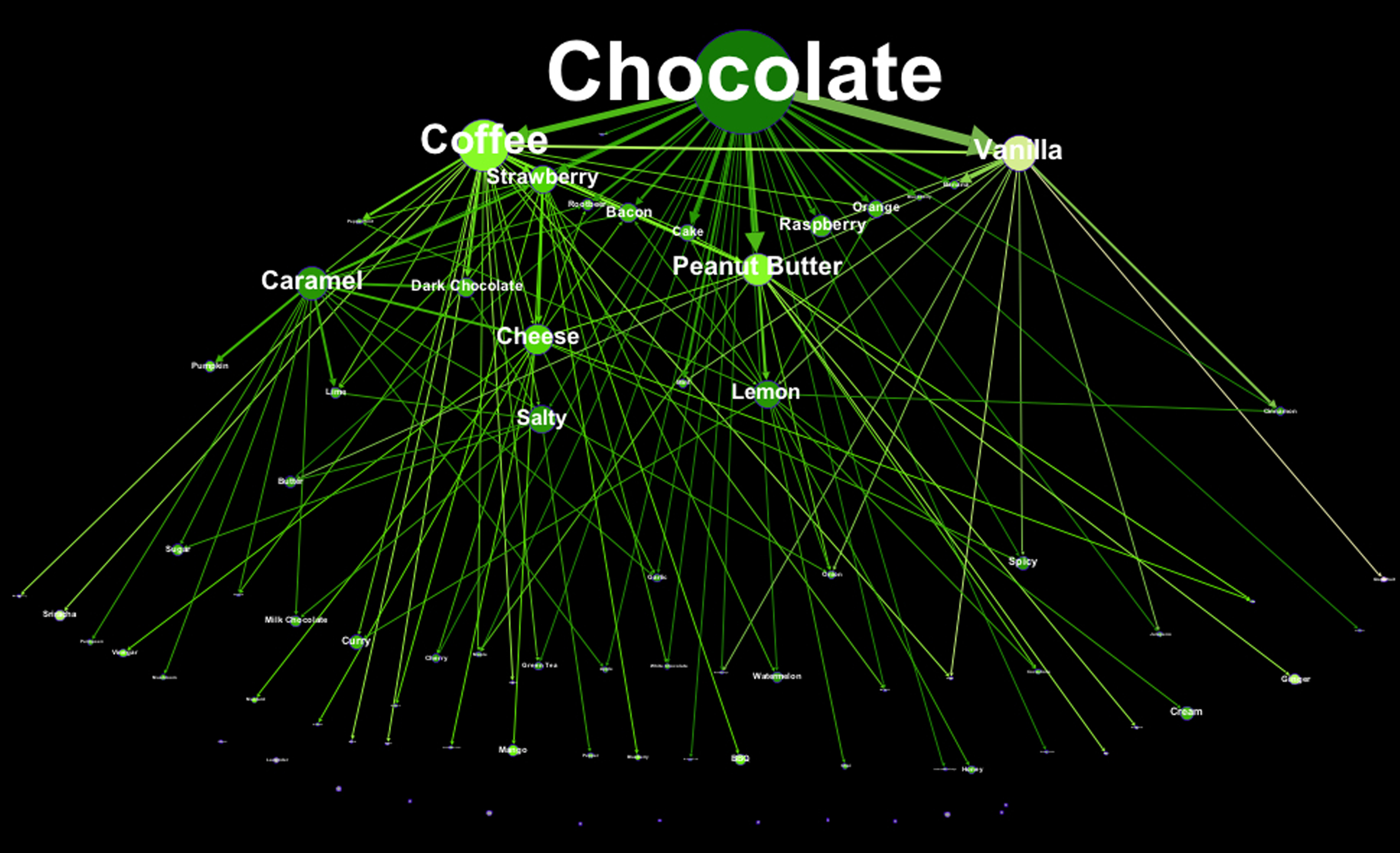
The last visualization I created for an easy to read hierarchy of flavors is called the Umbrella Model. Chocolate, being the most significant flavor, is at the top and one can follow any path downward to find which flavors (again using heat, size, and edge weight for significance) are more marketable to chocolate lovers.