Sweet to Savory
Graphing Bitterness FlavorPresented by Ric Peavyhouse, Hannah Lierman, Colin Shore, & Miles Dornfeld
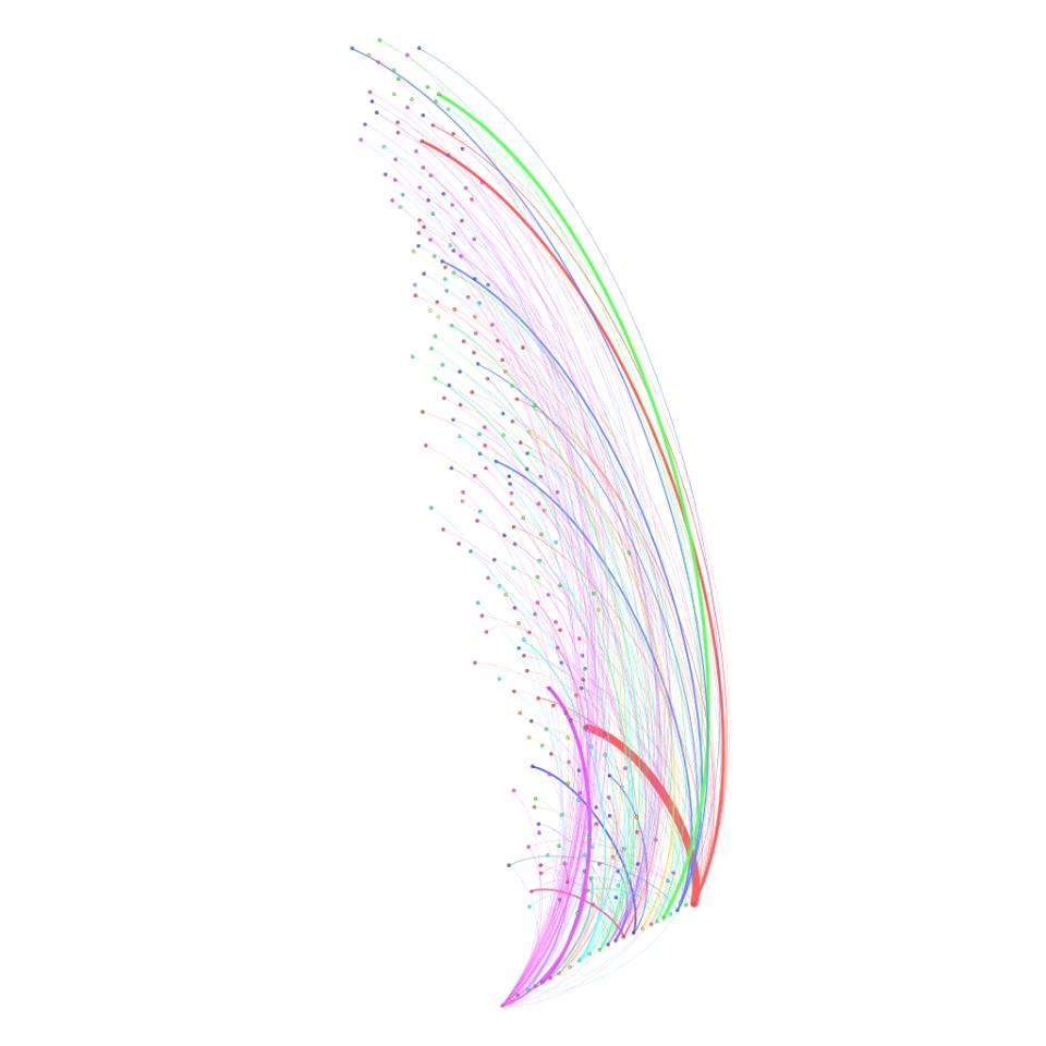
Analysis of the Flavor Feather
For our group flavor data project, we decided to code and organize the data based from a level of 100 (sugary flavor) to 1 (savory/bitter flavor). When we first looked at the mass flavor data, we saw many similarities including flavors themselves and overall composition of both sweet, salty and all in between. From there, we made inferences on a scale of 1-100 of what we subjectively believed to be sweet or the opposite. This view holds validity because flavor is a subjective factor to all audiences.
This visualization shows the flavors collected and where that flavor best identifies on our 1-100 scale. Our display goes from left (1 and least sweet) to right (100 and sweetest) in overall sweetness factor, with the more common flavor choices being the thickest lines throughout i.e. chocolate, caramel, ect. On the other side the thinnest lines have the least shared commonalities between people within our study. Dots displayed on the far left of the scale have little to no sweetness. Where as dots on the right of the scale correlate with the sweetest items chose.
As you can clearly see the thickest line overall and most chosen flavor was the thick red (chocolate) line, which was the sweetest flavor and can be found on the far right (100). Where as the thin red line (strawberry) also had very high sweetness levels at 100, but not as much popularity. Exactly along the same lines as the vanilla flavor (green), which is near 100 on our scale but ranks right at 85. Down the scale to the left we get to flavors such as caramel (thin red) that hit flavor ranks right in the middle at 65. As you keep going along the visualization you will find flavors such as coffee (thick purple) that correlate with the more popular bitter, grassy and spicy flavors that rank more towards the beginning of our scale at 12. Some of the least liked flavors consisting of burnt cheese (thin purple) and bourbon (thin lighter purple) are ranked on the lowest end right at 1.
A complete analysis would tell you that overall subjects in the study favored the sweeter things in life compared to the savory, spicy and grassy flavors. Lastly, it must be stated that the dots on the visualization scale going up and down correspond to the names of flavors. Flavors are arranged in alphabetical order, with the a’s starting on the lower vertical end and the z’s located at the top of the vertical side. Examples of this would be the green vanilla line at the top of the display and the red caramel line in the middle more towards the bottom of the graphic.