Seeing the Storm

In the fall semester of 2013, I worked with a team of undergraduates to gather an impression (in the Derrridian Archive Fever sense. We collected the and coded ever visual shared via social media by any television station in a Tornado Alley state. This data was then read using a combination of Qtip and ImageJ to offer an inter-rater reliable distant maps of the image vernaculars of social media delivered by local television stations through social media. Methodologically this project is strongly informed by Manovich's Visualizing Vertov. There are nearly ten thousand images in our primary dataset. These first images use computer vision to automatically produce reliable optical (as distinct from visual) metadata.
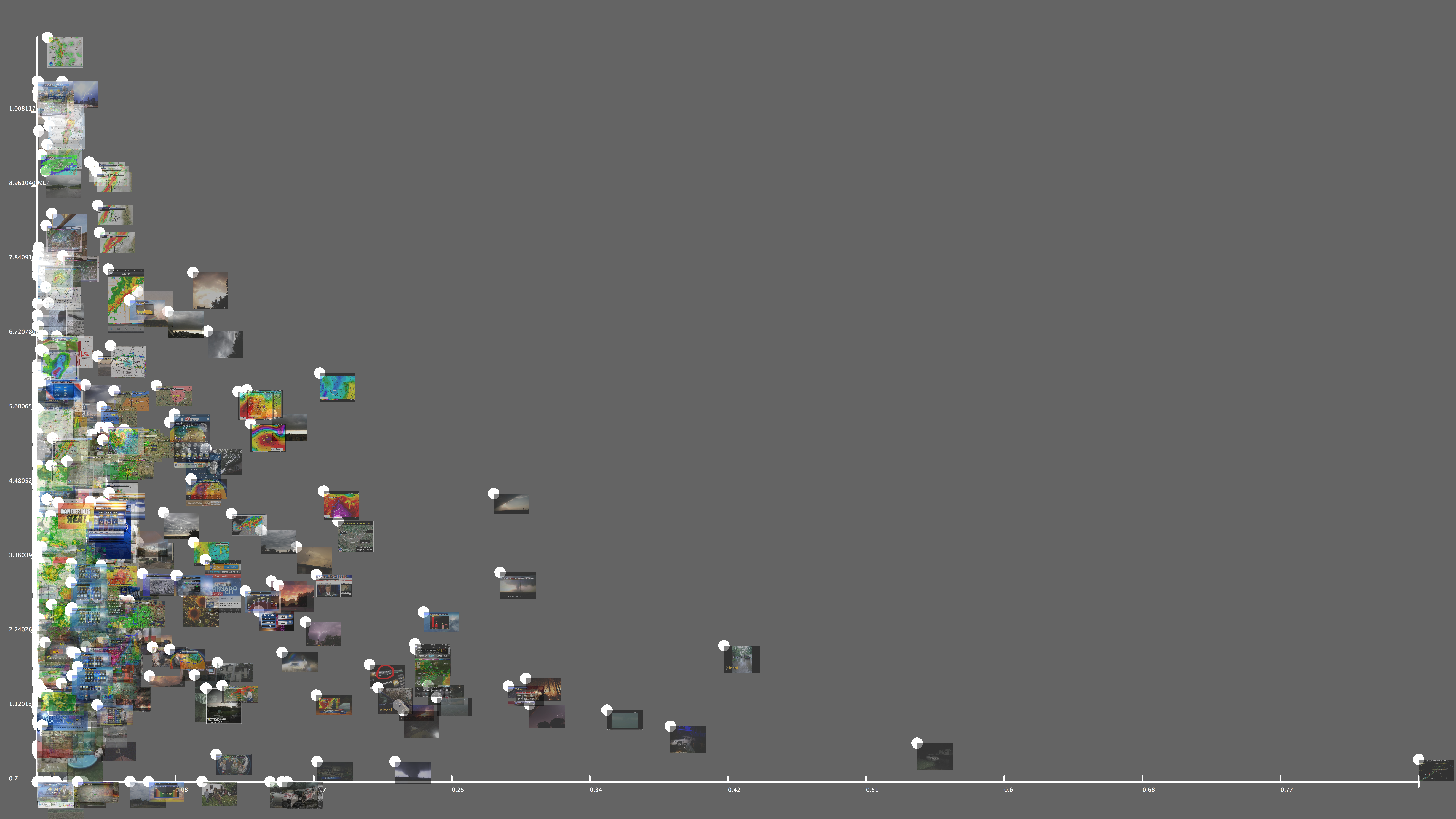
The first image used a combination of contrast and Sobel detection to sort the relative perception of edges. The nex image features a different intensity measurement compared with a reading of Kurtosis, which we are using as a proxy for messiness

In this image, the extremely ordered nature of an agential image of the Tornado begins to take shape. Tornado's loom large in the American weather imaginary and are often fetishized in a way that may contribute to storm deaths as a result of other, less emotionally charged winds.
Distant reading can also map meta-data. The following montage graphic uses both graphic date and type to let us see the communication pattern of an entire Tornado season in Kansas.

If you were to zoom in on this image you would see the individual graphics of dozens of stations, sorted by type and day.
What is most striking about this initial data collection is that there are very few images designed to build para-social relationships with weather forecasters. This approach to data collection and analysis challenges some important preconceptions in weather and climate communication and in future iterations should contribute to providing an empirical base for social media crisis research.